
Solo UI Designer
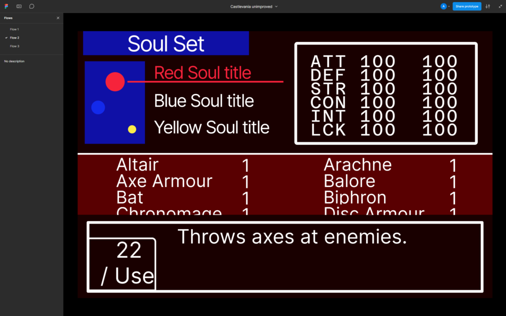
Having played Aria of Sorrow recently at the time of this project, I was frustrated at the lack of a loadout system in the game, when swapping out items and abilites was such a crucial aspect of the game loop. This project gave me the opportunity to imagine my own version of this system that maintains the spirit of the system but modernises it to improve usability through interaction design. I made a functional whitebox for an improved layout and feature list to improve the loadout system.
This prototype was made in Figma, including also a recreation of the original loadout menu for user data analysis to pinpoint any issues players have with the existing system.
Before
After
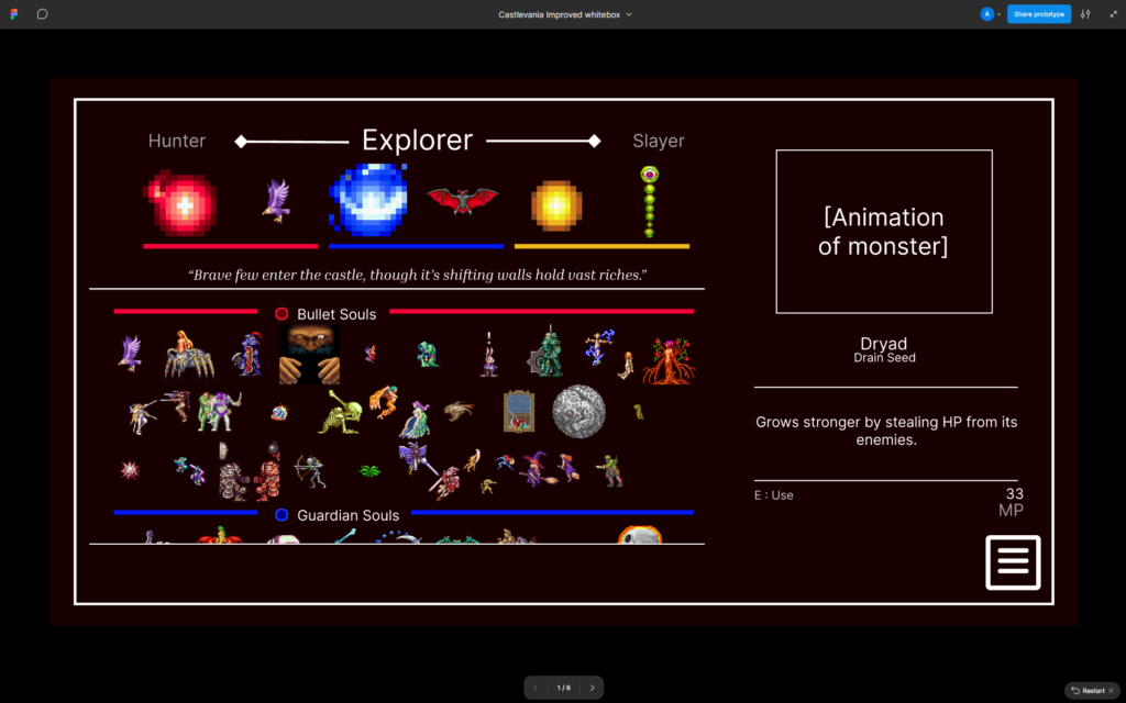
This project used assets from the game Castlevania: Aria of Sorrow which were sourced from The Spriter’s Resource.
- Tools: Figma
- Dev Time: 2 Weeks
Production
Original recreation
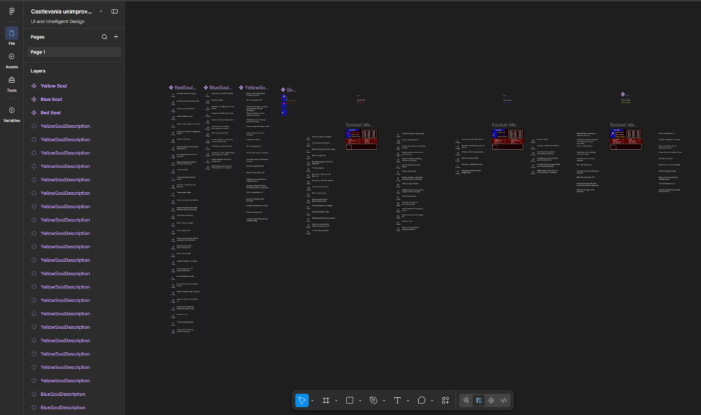
Each item in the loadout system requires data to store a description and MP cost. My initial recreation didn’t store this data robustly and used a lot of redundancies to make sure that all data was available all the time. In future iterations, as my skills with Figma developed, my organisation and modular thinking improved for a more manageable workflow.
Some implemented features included letting players switch between the 3 types of souls by pressing switching sub-menus to open a new catalogue of soul powers. Soul descriptions could be accessed by hovering over each soul in a scroll box. I was limited by the design of the original menu at this stage so that I could retrieve actionable improvements from users.
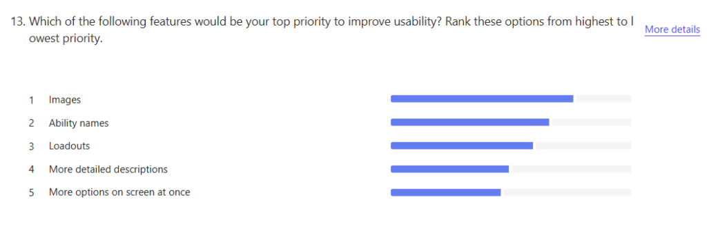
Through a simple survey, it was found that the resounding opinion was that images to distinguish soul items would vastly improve the user experience. A collection of quantitative data around recognition and frustration was collected as well to prove the success of the improved UI.
- Recognition: 7.33 out of 10
- Frustration: 5.67 out of 10
Improved Prototype
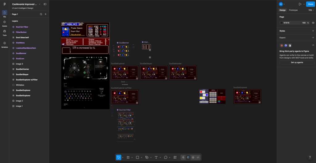
Despite being more feature dense, the complete prototype has significantly less clutter and overall a cleaner workflow using the set variable function rather than handling a load of instances at once. Inspiration photos from the original Aria of Sorrow and the Hollow Knight series were used to get an idea for menu spacing.
Changes to UI elements are handled using the Figma variant system, meaning a minimal amount of moving parts need to be developed. For example, soul icons can use one component with 5 variant states:
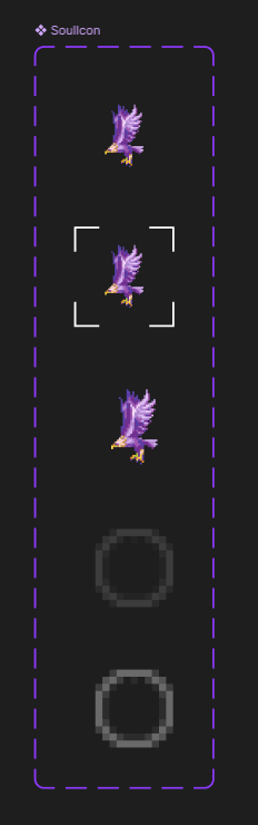
- Default
- Hovered
- Equipped
- UnequipHover
- Unequipped
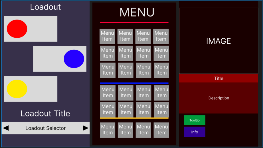
Various iterations were blocked out to find a suitable visual hierarchy, this iteration didn’t have enough space to store item icons and was scrapped. However, the hierarchy of information for the description box remained throughout development.
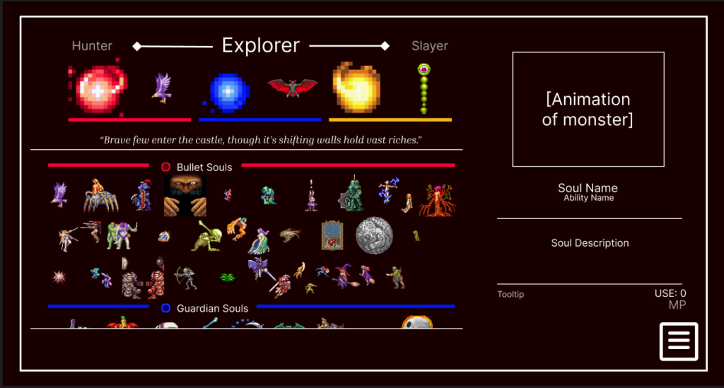
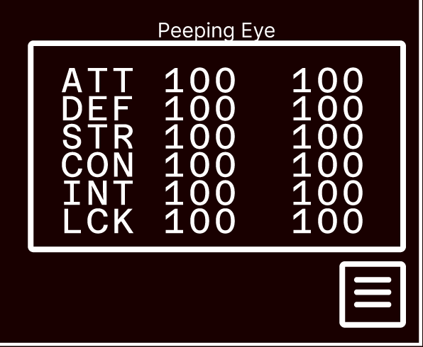
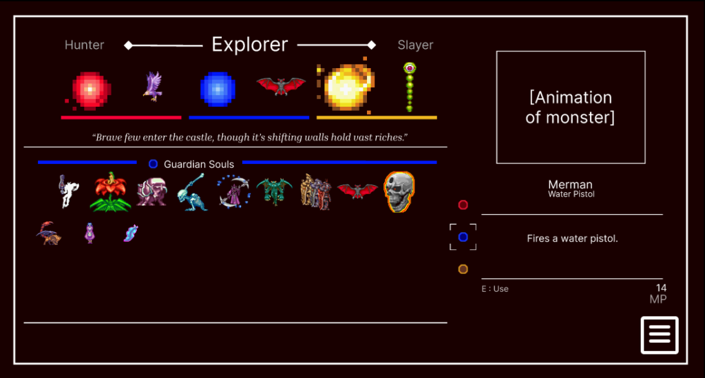
The final layout took the 2:1 ratio of menu to description box from the Hollow Knight games and utilised a scroll box to store souls. As some souls effect stats, the player stats can be viewed from the hamburger menu in the bottom right.
The loadout feature was completed using a prototype button to switch between menus. Player feedback is presented by highlighting buttons as the player hovers over them. Souls can be unequipped by clicking the soul icon which also provides player feedback by showing a translucent version of the empty slot icon. Each loadout is given flavour text and a title to give players guidelines for the sort of kits they should have prepared:
- Explorer – “Brave few enter the castle, though it’s shifting walls hold vast riches.”
- Slayer – “It is our solemn duty to vanquish the great evils of this world.”
- Hunter – “A hunter must arm themselves for the army of darkness that awaits.”
Additionally, description box information is updated modularly in real time and highlights the selected soul with a outline to improve player feedback. The decision to put all souls in one segmented scroll box improves retrieval time without increasing cognititive load as items are still neatly divided.
Additional feedback included requests for a soul filtering system, which was implemented to allow the player the choice between looking at all soul types at once or only one at a time.
A similar survey was put out to the applicants to the first survey. User testing was conducted in both cases to time recovery of certain soul items which was markedly faster with the improved loadout, especially considering that the first user test had multiple users take more than a minute to find one soul item.
Identical quantitative data questions were presented to users in both surveys. In measures of recognition and understanding, results leant more positively for the improved loadout.
- Recognition: 8.75 out of 10 (compared to 7.33)
- Frustration: 3.25 out of 10 (compared to 5.67)